Piedmont Residential Launches New Website by Meredith Communications
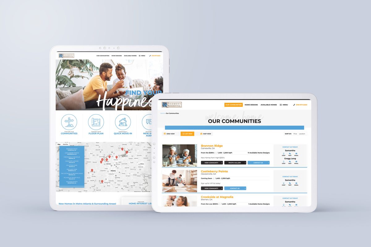
Meredith Communications cannot wait to share our newly developed website for Piedmont Residential. This is the fourth website we’ve both designed and developed for Piedmont. We are thrilled to continue to share their story through our quality website design, SEO, SEM, Social Media Ad Management, and Blogging services
Who Is Piedmont Residential?
Piedmont Residential is the premier builder in Atlanta, Georgia. They specialize in building homes in distinctive neighborhoods for couples and growing families.
Piedmont takes pride in its thorough building process and strives to meet the needs of each individual homeowner. Their team of experts is dedicated to making the buying and building experience as unique and personal as possible.
Website Look & Feel
Our primary focus with this redesign was to enhance navigability and ease for the consumer while improving overall conversion rates.
- Home Page—The website user is immediately struck with a feeling of belonging and home with a warm rotating hero image display of lifestyle images and product photography.
- Navigability—Directly below, the user will find large icons that will allow quick access to Piedmont’s most popular content including Communities, Floor Plans, Quick Move-Ins, and New Agent Contact Information. The user is also able to use the combination of a traditional menu and a hamburger menu for quick, intuitive navigation without the compromise of streamlined visual design.
- Interactive Maps—This feature gives users the option to explore an aerial overview of all Piedmont Communities. Each pin on the map lists location and pricing information and directs users to the corresponding community’s page.
- Communities Page—In order to cater to each individual user’s needs, we have included multiple view options to display Piedmont’s available communities. Users can view communities in a grid, list, or map format. Additionally, users can sort communities by price or location to more easily find a home that fits their lifestyle.
- Community Detail Pages—Piedmont is dedicated to building new homes in highly valued neighborhoods. We wanted to incorporate the newest website design trends to showcase their beautiful, thoughtfully planned communities. Upon entering the Community Detail page, the user is greeted with the most important community information including pricing, square footage, and home type. This is followed by a detailed description and a display of product and lifestyle pictures. Users are given the option to request more information or participate in a Live Chat session with Piedmont’s expert staff. At the bottom of the page, the user can also explore floor plans, an interactive site map, directions, and contact information.
- Home Designs Search—Piedmont is passionate about satisfying the needs of its buyers. In accordance with this mission, we wanted to make it easy for users to find a home design that is perfect for them. Users can sort home designs by style and size. Designs are also separated by first and second-floor owners’ suites.
- Home Design Pages—Each individual home design page includes product images, bed and bath count, square footage, garage size, and a floor plan brochure. The user is encouraged to move forward in the sale with various call-to-action options. At the bottom of the page, the user can explore various personalization options with the interactive floor plan display.
- Call To Action—In an attempt to improve conversion rates, we strategically incorporated a number of call-to-action tactics throughout the site. Our design strives to help connect users to Piedmont’s team of experts through the use of Live Chat, OSC, available contact information, Schedule a Tour Option, Coming Soon VIP Form, and Contact Us Form.
Behind the Scenes
Though we are proud of the visual quality of Piedmont’s new site, it’s also important to acknowledge the behind-the-scenes elements. This website was designed with both user and builder in mind.
- SEO—In order to increase website traffic, we thoroughly optimized the entire website with relevant SEO keyword phrases. We carefully crafted each community page description with keywords to help drive users to Piedmont Residential’s site.
- Catalyst—With the new design, Piedmont Residential is able to conveniently update their lot and site maps in our Custom WordPress CMS called Catalyst. Unique to Meredith Communications’ website design, Catalyst provides ease to our builders in navigating the robust database functionality they require to manage floor plans, communities, and available homes. Through this tool, builders are able to efficiently and effectively manage their content.
- Conversion Rates—According to Google Analytics, because of our intentionally worded call-to-action messages and abundance of options, Piedmont’s website is predicted to have a 3% Goal Conversion rate. The industry average for website conversion is 1%-2%, meaning this new site design is outperforming the average builder website. Though we love building beautiful, inspirational website designs, we don’t love it nearly as much as creating high-performing, high-converting builder websites.
Want to See More?
We are so excited to share Piedmont Residential’s story through our new and improved site design. As always, it was a pleasure working with Piedmont to create a stunning, well-crafted website to highlight their dedication to excellence in the home building industry.
At Meredith Communications, we strive to help builders use digital tools to tell their story and grow their business. Check out our portfolio to see website projects, case studies, and us doing what we love!
Categorised in: Digital Marketing, Home Builder Marketing & Sales, Home Builder Websites, Meredith Communications News, Website Design, What We Do


