Meredith Communications Launches New Website for Key Land Homes
Meredith Communications is thrilled to announce the launch of the new Key Land Homes website. As a trusted partner since 2010, this is the fourth website we’ve designed and developed for long-standing client, Minneapolis-area premier home builder, Key Land Homes.
We’ve worked hard to ensure each iteration has modernized and enhanced the user experience across all devices while telling the Key Land brand story in an engaging, informative way.
Who is Key Land Homes?
Key Land Homes has been building family-friendly, affordable homes in 15 communities in the Minneapolis-St. Paul region since 1983. Their commitment to quality construction and processes, customer-focussed home-building guidance and value have earned them accolades and a reputation as one of the region’s top builders. Clients, in turn, appreciate the honesty, integrity and respect shown them throughout the buying and building process.
Website Look & Feel
It was important to Key Land that their new website conveys a company and culture that was fun, community-minded, and flexible. Recognizing, too, that clients spend more and more time researching and pre-shopping, it was also vital Meredith Communications create a visually beautiful and technically seamless experience. To do this, we incorporated evocative lifestyle imagery, clean graphics, and informative, fresh content tailored to Key Land’s market audience.
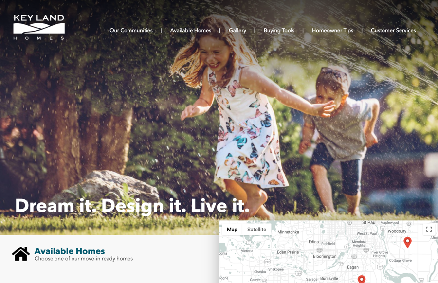
Right from the start on the landing page, the user is hooked. A big, bold hero image of children running through a sprinkler, a photo gallery of Key Land homes, and an image of a mother embracing a child, exude a sense of warmth and comfort and spark an emotional response – one associated with homeownership. Imagine raising your family in your own Key Land home? The tight copy completes the brand messaging daring the visitor to “Dream it. Design it. Live it”.
From here, the navigation to other parts of the website is simple and intuitive. The main navigation bar features six headings – Our Communities, Available Homes, Gallery, Buying Tools, Homeowner Tips, and Customer Service. Drop-down menus appear as you hover over each heading enabling quick and easy navigation to other pages.
As you move down the home page, we’ve included a rich and dynamic map of the Minneapolis area, highlighting all of the Key Land Homes communities on the map as well as below in list view giving users the choice of how to navigate to each community. In the list view, bright, evocative images define each community while clear text, imposed on the images, indicates the various starting price points for the homes – simple and informative.
Navigating either way to Community details, the user is presented with additional images, maps, and clear, concise information on available homes, community profile, and contact information.
The Key Land blog is prominently featured across the website. Clean block graphics highlighting various blog topics, display consistently in a banner along the bottom of every page of the site enticing users to visit the blog with catchy and topical headings.
Finally, proprietary access for agents, lot listings, and the privacy policy are accessible via links in the footer.
The Nitty Gritty
Innovative and modern, the new site was not only designed to look better, but also to help Key Land Homes grow their business. We’ve incorporated the very latest in SEO, Google Ad Management, mobile responsiveness, and blogging services to optimize traffic and deliver ROI results quickly. This is the result of three technical decisions:
- Mobile First
Every design and tech decision for this website prioritized the mobile experience. This mobile-first approach demands that all design and prototyping of the website be done for the small screen first in order to ensure the user experience is optimal and seamless across all devices. And by virtue of mobile’s more challenging design parameters (screen size, bandwidth, etc.), a mobile-first approach must also be a content-first approach. Images, graphics, and copy must be as sharp and tight as possible to ensure they translate smoothly across all devices big and small. This is why Key Land’s website copy has been pared down to the very essence of their brand – punchy and perfect!
- WordPress
Choosing WordPress and opting for a proprietary and custom WordPress Content Management System called Catalyst™, we created a highly flexible, easy-to-use website customized specifically to the home builder’s needs.
The WordPress platform is a favorite of Meredith Communications for a number of reasons:
- It is flexible and user-friendly facilitating easy updates and changes;
- We can custom design a theme specific to the builder’s brand;
- WordPress is a Google favorite. WordPress sites rank highly on Google and other search engines due in part to SEO-optimized content and mobile responsiveness;
- It has a built-in blog making it very easy and intuitive to publish content vital to the website’s SEO performance; and
- The WordPress plug-in directory is extensive and always expanding making it easy to extend functionality in a variety of ways that help websites, like Key Land’s, stay current. These plug-ins can be activated and de-activated as the Key Land Homes website evolves.
- Content Management System
Our proprietary custom WordPress CMS for Home Builders, Catalyst™, in turn, was an obvious CMS choice, offering plenty of advanced functionality to enhance the already rich WordPress platform, including CRM, SEO, analytics, and email marketing features. (In an upcoming post, we’ll delve deeper into the benefits of Catalyst – stay tuned!)
Collectively, all these features will help boost the Key Land brand and ultimately, sell more homes!
—
Now that you have an understanding of our process and choices, visit the Key Land Homes website to experience it!
Categorised in: Content Marketing, Digital Marketing, FANtastic Marketing Tips, Home Builder Marketing & Sales, Home Builder Websites, Meredith Communications News, Website Design, What We Do


