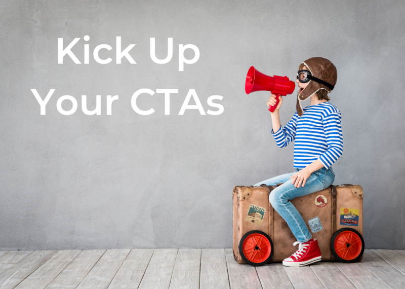
Kick Up Your CTAs
May 21, 2019Call To Actions, more commonly known as CTAs, are things on your website or social media that urge people to act. For example, your “more information” button is a CTA. It encourages fans to take action and get more information, download something, or simply move to another page. But if your CTAs aren’t doing as well as you hoped they would, it’s probably time to reevaluate them by focusing on three key areas: The Who, The What, and The Where.
The Who
As with any marketing strategy, it’s important to understand your target audience so you can write your CTAs properly. Is your target audience made up of first-time homebuyers? Is your audience made up of local realtors? Keeping your target audience in mind when composing the text for your CTAs will make them more engaging and enticing, and ultimately lead to more action. Also, your target audience can actually help you figure out the correct wording for your CTA. Let’s take, for example, a first-time homebuyer. S/he may respond better to a button that says “Click For A Look at Your New Home.” Meanwhile, a realtor may be more responsive to a button that says “Click For a Demo.”
The What
What does your CTA look like? Is it bright and bold? Does it stand out? If your customers don’t see it quickly, they probably won’t click it—which is the opposite of what you want. So the design of your CTA is critical. In fact, your CTA should be recognizable no matter where its placed—your website, online ads, and social media are some examples. So make sure to select a color and write copy that stands out. While there isn’t a magic formula that explains what will work best, be sure to keep your audience, your product, and your web design in mind when going through the creation process. Using bold fonts and images can also draw the eye. Finally, know that a bigger button can help your CTA stand out. But don’t make it obnoxious!
The Where
If you only have one CTA on your page, that could be why it isn’t performing well. The more CTAs that appear on a page, the more likely your CTAs will entice readers to click them! Using more CTAs can really kick up your conversion rate. But don’t go posting CTAs where they don’t need to be—you’ll probably alienate a few fans this way. A few more tips to keep in mind: Make sure that the CTAs are bight and bold but don’t compete with each other. Plus, have CTAs on every page of your site—even if it only takes visitors to another page within your site. If you’re unsure about placement, test CTAs with a small focus group. Getting feedback from fans will help you better understand your audience and help you design your page to their needs!
CTAs are so important when it comes to encouraging your fans to take action. Need help to ensure your CTA buttons are placed perfectly? Contact Meredith Communications! We offer a variety of services including web design.
Related Posts:
Categorised in: Content Marketing, Digital Marketing, Lead Generation, Website Design


